22 April 2024 - 27 May 2024 / Week 1 - Week 6
Sim Jia Min 0349784
Creative Brand Strategy / Bachelor of Design (Hons) in Creative Media / Taylor's University
Task 3: Campaign Branding
INSTRUCTIONS (MIB)1. Logo
I started this project with the logo design since it is the most crucial thing that needs to be featured on everything else. As planned in Task 2B, I am making a hawthorn character mascot design with English and Chinese wordmarks.
 |
Figure 1.1: References of mascot design
|
 |
| Figure 1.2: Mascot design in B&W |
I initially wanted to make it into a totally round shaped mascot, but then I thought it might be too simple without any other features, so I added the little hawthorn stalk on the top and hands+feet.
 |
| Figure 1.3: Apply colours on mascot design and explore it with wordmarks |
Didn't spend much time deciding the colours since it is clearly going to be red as the hawthorn fruit itself. I experimented with both versions of mascot designs I made, along with some expression exploration, and also tried out the outline version.
 |
| Figure 1.4: Logo design final decision |
As I love both ideas of a
standing mascot with wordmark (left) and the
simplified rounded mascot with rounded wordmark (right), I decided to keep both as logos. But the left one with the full body is the proper official logo, while the one on the right is going to be an alternative logo.
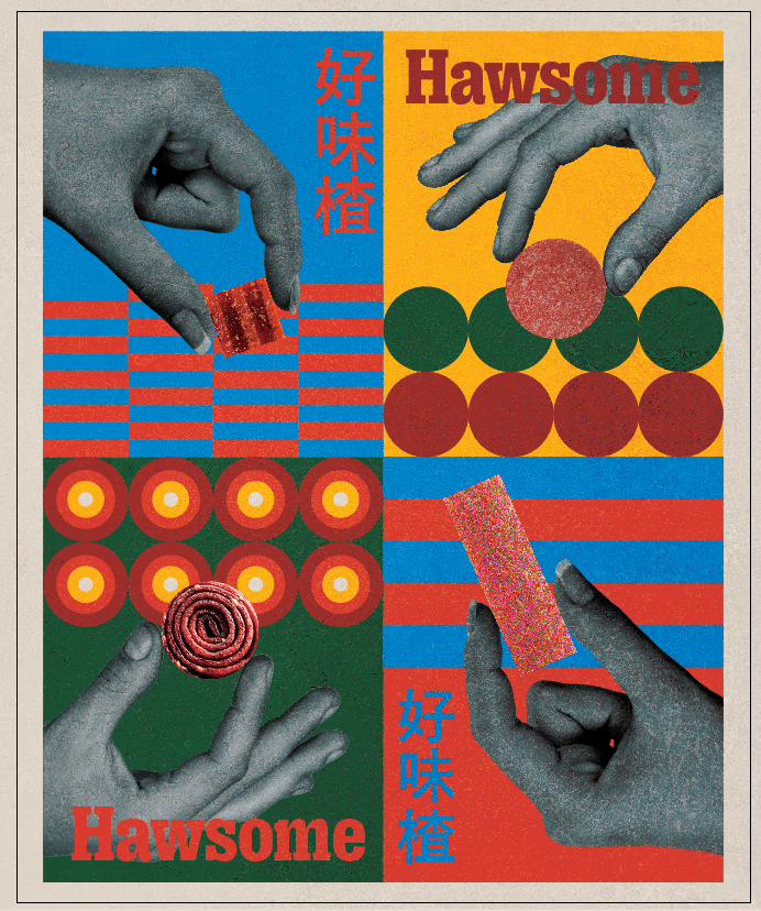
2. Graphic Elements
For the graphic elements, I am referring to the shapes and forms of haw sweets - flakes, cubes, rolls, strips
 |
| Figure 2.1: Different types of haw sweets |
 |
| Figure 2.2: Sample graphic elements with brand colour palette |
3. Online Touchpoints
3.1Website |
| Figure 3.1.1: Website wireframe |
I initially made simple wireframes first to have a rough idea of how the website would possibly look like with a horizontal-scroll page.
 |
| Figure 3.1.2: Website WIP |
 |
| Figure 3.1.3: Website WIP |
The progress turned out not as exciting as I planned in my mind, as I didn't use the full colour palette I initially planned, so it looked off and didn't really fit the branding concept of Hawsome anymore, it's a disaster.
 |
| Figure 3.1.4: Refined website WIP |
After listening to Miss Lilian's suggestions, I refined the website design by actually applying the full-colour palette and more graphic elements. It does look much better and can showcase the youthful and energetic brand personality of Hawsome.
However, I was having trouble with making horizontal scroll pages with Figma, since I never actually learned how to do prototype and Figma before, so it does take a while for me to figure out how to make it work.
3.2Social Media
 |
| Figure 3.2.1: Social media WIP |
The social media planning was a bit lacking initially, as I wasn't really focused on this part. But one certain thing is that I wanted to build the social media with both photos and graphics like these eye-catching references below:
 |
Figure 3.2.2: Social media references - photos and graphics mixed
|
So then I properly planned a posting order that can possibly bring out this:
1. Graphic - Teaser: Something that hints the brand is launching soon?
2. Photo - Haw flakes photo on first, packaging on second
3. Graphic - Fun facts about hawthorn
4. Photo - Haw rolls photo on first, packaging on second
5. Graphic - Promotional video (As this position is the center of the Instagram layout, so I thought putting something important like promotional video is suitable)
6. Photo - Haw cubes photo on first, packaging on second
7. Graphic - 1:1 promotional poster
8. Photo - Haw strips photo on first, packaging on second
9. Graphic - Brand tagline
To conclude, the photos are all haw sweets, with their own packaging on the second slide, while the graphics are more like brand promotional materials.
 |
| Figure 3.2.3: All design drafts of social media posts |
I ended up picking the few that I thought would work the best for final social media posts.
 |
| Figure 3.2.4: Final social media profile |
3.3. Promotional Video
The initial idea for promotional video is something like combining the past of traditional Chinese haw sweets and the present of modern haw sweets made by Hawsome, a contrast of past and present. But then after the consultation with Miss Lilian, the feedback is that the video length is too long, and at some point viewers can get bored of it.
 |
| Figure 3.3.2: Refined video WIP |
So I planned to make it minimize the video to 30 seconds, and then abandon the combination of past and present, just focusing on the present Hawsome itself, along with some exciting colours and music that fits the brand personality.
Final promotional video link: https://drive.google.com/file/d/1YI2Q_V5r7iB9Hc_SURc82Mb3vQ3WyB0I/view?usp=drive_link
3.4: Newsletter by Hawdy
The idea of this newsletter is to showcase how Hawdy will send letter of news about Hawsome and its personal journal writing to the newsletter subscribers.
Then I came up with the idea to make two newsletter designs, the first one is the welcome letter that the newsletter subscriber will first receive once they subscribe. The second one is Hawdy visiting a hawthorn farm during the hawthorn fruit season around September. The letter content is all written in the first person perspective of Hawdy, to showcase Hawdy as a friendly mascot that communicates with the Hawsome community and brightens up people's day with its cute and warm letter.
 |
| Figure 3.4.1: Newsletter - welcome letter WIP |
The initial draft had the same problem with the initial website design, too bland and lacking of colours, and lacking of graphic elements as well.
 |
| Figure 3.4.2: Newsletter - welcome letter WIP |
Then I proceeded to make some refinements to get rid of the blandness, but then I figured the graphic pattern in this doesn't work well, they look very off together.
 |
| Figure 3.4.3: Final newsletter - welcome letter |
I got rid of the big-size graphic pattern and minimised them into a smaller and more colourful one (on the top right and middle bottom), I think this looks better and is not as loud as the previous one. I also repositioned the placement of text as I thought the text placement of the previous design was lacking something, this version certainly looks much better to me.
 |
| Figure 3.4.4: Final newsletter - Hawdy visiting hawthorn farm |
Just like the welcome letter, I apply the same idea to the second newsletter.
4. Offline Touchpoints
4.1: Packagings
 |
| Figure 4.1.1: Packagings WIP |
I started the packaging with the front design, combining the photos of haw sweets along with the graphic pattern.
 |
| Figure 4.1.2: Packagings WIP |
Along with the idea of front packaging design, I started to expand the design on the packaging dieline template.
 |
| Figure 4.1.3: Exploration with other colour |
Then I tried to explore the packaging with other colour from the colour palette. I didn't like how it looked, as I thought it looked off with the dominantly red brand logo, they just didn't match well together, and not fitting the colour of the actual haw sweet itself.
 |
| Figure 4.1.4: Final haw flakes packaging |
 |
| Figure 4.1.5: Final haw rolls packaging |
3D view link:
https://www.pacdora.com/share?filter_url=psg14vsrqh |
| Figure 4.1.6: Final haw cubes packaging |
 |
| Figure 4.1.7: Final haw strips packaging |
3D view link:
https://www.pacdora.com/share?filter_url=psvg9htn3b4.2: Merchandise
Merch 1: Tote bag
For the tote bag design, I decided to apply the tagline design on it, the design idea is to combine the tagline along with the graphic elements.
 |
| Figure 4.2.1: Tagline design 1 |
 |
| Figure 4.2.2: Tagline design 2 (centralised ver) |
 |
| Figure 4.2.3: Final tote bag design |
Merch 2: Paper bag
For the paper bag design, I planned to apply the graphic elements on it along with the brand logo.
 |
| Figure 4.2.4: Paper bag WIP 1 |
The feedback for this is that the colours are too mono, suggested applying other colours from the palette.
 |
| Figure 4.2.5: Paper bag WIP 2 |
The repetitive colourful pattern seems a bit too messy on this design, Miss Lilian suggested to minimise the pattern to 4, or putting the pattern on the side
 |
| Figure 4.2.6: Final paper bag design |
4.3: Pop-up display rack
 |
| Figure 4.3.1: Pop-up WIP 1 |
The same mistake as other touchpoint designs, it is lacking of colours.
 |
Figure 4.3.2: Pop-up WIP 2
|
I think this one looks a bit too busy, as the patterns are too repetitive, making the display rack look messy.
 |
| Figure 4.3.2: Final pop-up |
|
For the final refinement, I decrease the amount of repeated graphic elements to make it less messier.
Figure 5.1: Final Presentation
FEEDBACK
Week 11
- The outline ver of logo looks nice, but careful with the size of the shapes because they dont looks the same is the normal ver
- The round mascot one is quite bland without body, doesn't look like hawthorn anymore, might need to include the stalk on top of it as well
- Be mindful of the graphic elements in the tagline design
- Packaging design need to include all the other surfaces (dieline template), nutritional info and everything
- Progress is quite lacking
Week 13
- Website design is lacking of colours and graphic elements
- Overall the designs are lacking of consistency, some doesn't fit the brand personality
- The promotional posters design is aligned with the brand personality
- Use the entire colour palette
- The heading font changed it to the bold and sans serif one, it works better
- Video too long, people don't have enough attention span for that
Week 14
Website:
- make it more character more playfulness
- use the bold subheading typefacd more
- play with colours, layout and placement of text
Poster:
- Place logo consistently
- Paperbag and popup:
- Experiment with colours
Promotional vid:
- Too long
- The vid and footage make them all fit to the screen, with text overlay on it, give abit context
- Present - just a quick 2 sec clips for each
- Mascot roll in
- Then showcase the graphic pattern, that hv been made
- The brand logo can be only introduce at the end
- Rolling mascot at the end of vid
Overall feedback: lack of cohesiveness, should experiment more with colours
REFLECTION
The experience of doing this project wasn't the smoothest since I found myself often wasting my time too much focusing on one part too much while abandoning the other parts of the touchpoints. I spent quite a while on the packaging design since I was quite hesitant about whether to put other colours instead of red on all, so I went back and forth to change the colours again and again but still end up decided to stick with the red one. I especially I struggled with the part of making the website prototype because the horizontal scrolling was a bit confusing to manage, and this was my biggest letdown of the project as it ended up not present as what I was planning in my mind. But one thing that is quite solid is that I did plan a certain design direction for Hawsome, although there was some time I still kind of lost the direction and made some disaster designs when I was doing this project, but after the feedback and suggestions, I still found my way to focus on the design direction that was planned. Looking back on this entire project, there are still some parts that I feel like I could've done so much better, especially for the website. The improvement that I should make is to make better time management while doing different touchpoints, avoid focusing on one part for too long and end up not having enough time for other parts. Also, I find that website, promotional video and social media planning are actually the top 3 touchpoints that I should spend the most time on because they are the touchpoints that will showcase the marketing strategy the most.
As I never designed a newsletter nor learned how to design a newsletter before, I looked up some online information to learn what a proper newsletter structure should look like.
Newsletter basic components:
Header: Includes newsletter’s title, brand logo, and issue number.
Introduction: Briefly outline the newsletter's content for both new and returning readers.
Core Content: Divide the main content into sections for easier reading.
CTA: Include multiple CTAs throughout or just one, but also not necessarily, depending on the goal.
Footer: Add necessary contact information and an unsubscribe link for compliance.


Comments
Post a Comment