Advanced Typography - Task 3
9 June 2023 - 7 July 2023 / Week 10 - Week 14
Sim Jia Min 0349784
Advanced Typography / Bachelor of Design (Hons) in Creative Media / Taylor's University
Task 3: Type Exploration and Application
LECTURES
Lectures are done in Task 1
INSTRUCTIONS (MIB)
Task 3: Type Exploration and Application
To visitors: the struggling blog author flopped badly at this project so avoid taking this mess as reference
Instruction:
- Create font: area of interest/specialisation/personalisation/refinement of existing font/experimental material
- Propose at least 3 ideas
- All capital & small letters, and punctuation
- Upload to Fontlab, adjust kerning
- Provide application of how the font can be presented, relate to the core idea and purpose of the font
Figure 1.1: Idea Proposal (Week 9, 31/5/23)
 |
| Figure 1.2: Typography in magazine cover title/headline (Week 9, 31/5/23) |
 |
| Figure 1.3: "FILM" magazine for typeface expansion (source) |
The typeface of the title looks very interesting for a magazine, it looks very different from other general magazines. I tried to look up to see if it is an existing font, but seems like it is not, which is why I have developed an idea to do a typeface expansion based on this magazine title.
 |
| Figure 1.4: Font dimensions (Week 10, 7/6/23) |
Cap line: 650px
X-height: 500px
Descender: -200px
 |
| Figure 1.5: First attempt (Week 10, 7/6/23) |
 |
| Figure 1.6: Slight refinement (Week 10, 10/6/23) |
Mr Vinod suggested using this for crafting rounded corners in a more concise way:
 |
| Figure 1.7: Circles for crafting letters (Week 11, 14/6/23) |


Figure 1.8 (left): Font - Bottleneck
Figure 1.9 (right): Bottleneck on magazine cover title
(Week 11, 14/6/23)
While crafting the letters, I also found a similar font to refer to, it is also used in a magazine cover title called "The Smudge".For the basic structure of alphabets, I refer to some sans serif typefaces such as Futura, Univers and Helvetica.
 |
| Figure 2.1: Anatomy of "X" |
 |
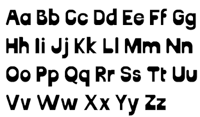
| Figure 2.2: Finalised uppercase letters (Week 12, 19/6/23) |
 |
| Figure 2.3: Lowercase letters (Week 13, 29/6/23) |
 |
| Figure 2.4: Numbers and punctuation |
 |
| Figure 2.5: Chaotic workspace (Week 14, 5/7/23) |
 |
| Figure 2.6: Outline view (Week 14, 5/7/23) |
 | |
|
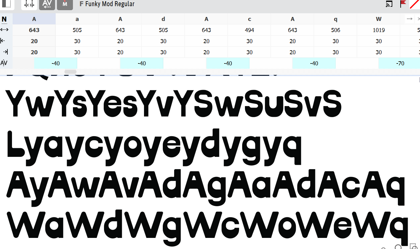 |
| Figure 2.8: Adjust kerning (Week 14, 6/7/23) |
 |
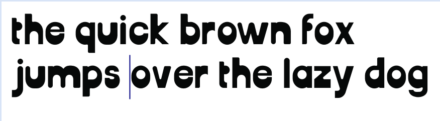
| Figure 2.9: Testing the alphabet with numbers and punctuation (Week 14, 6/7/23) |
 |
| Figure 3.1: Pair 1 (Week 14, 6/7/23) |
 |
| Figure 3.2: Pair 2 (Week 14, 6/7/23) |
Presentation of Typeface and Applications
 |
| Figure 3.3: Workspace (Week 14, 7/7/23) |
Font promoting
As promoting a font on the internet is a usual process of announcing a newly published font (reference: https://www.instagram.com/pangram.pangram/), here are some design ideas for promoting my font on Instagram:
 |
| Figure 3.4: Font promoting 3 (Week 14, 7/7/23) |
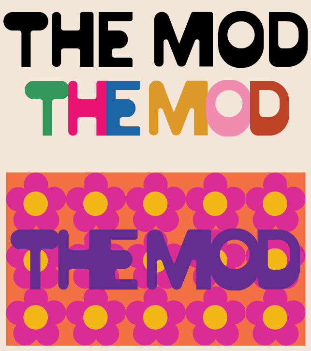
Application:
1. Title of the magazine
 |
| Figure 3.5: Magazine title (Week 14, 7/7/23) |
 |
| Figure 3.6: 60s pattern design (Week 14, 7/7/23) |
2. Magazine covers
 |
| Figure 3.7: Magazine cover 1 (Week 14, 7/7/23) |
 |
| Figures 3.8: Magazine covers 1 (Week 14, 7/7/23) |
3. Magazine content
 |
Figure 3.9: Magazine content (Week 14, 7/7/23) |
4. Tote bags
 |
Figure 4.1: Tote bag (Week 14, 7/7/23) |
 |
Figure 4.2: Tote bag (Week 14, 7/7/23) |
5. Business card
 |
| Figure 4.3: Business card (Week 14, 7/7/23) |
6. Billboard
 |
| Figure 4.4: Billboard (Week 14, 7/7/23) |
SUBMISSION
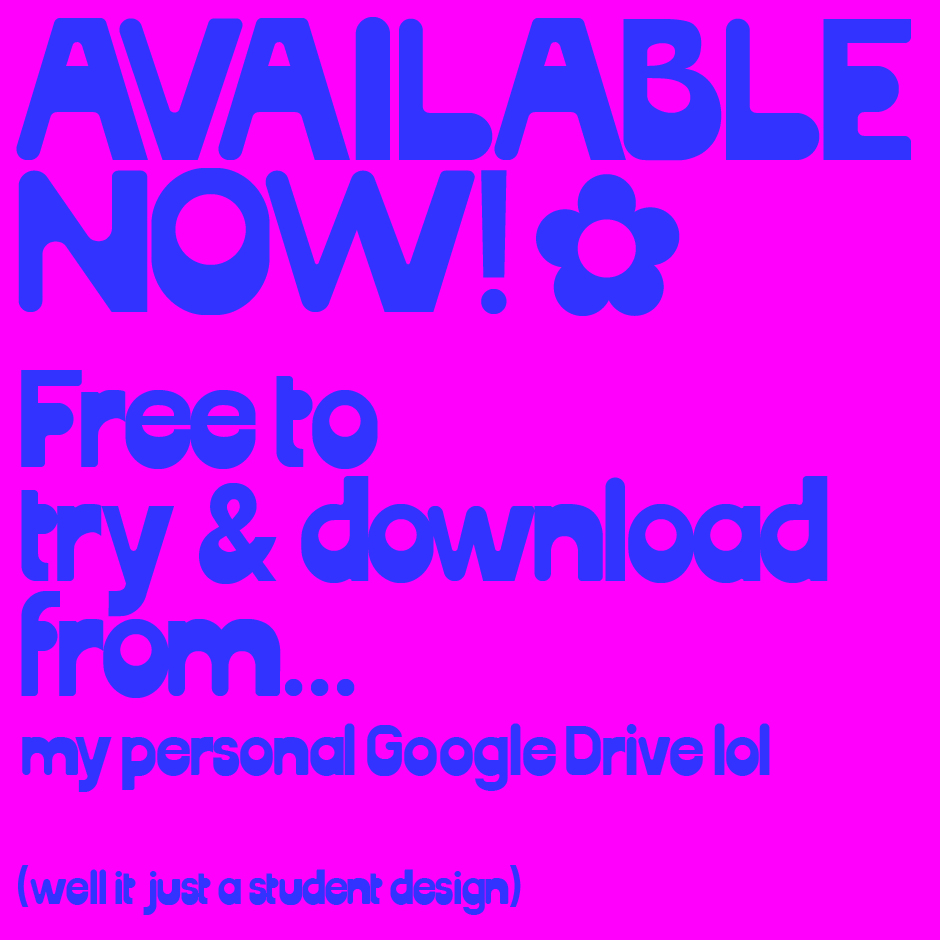
Funky Mod font download: https://drive.google.com/file/d/1CnSzNOkP0uUMQe-m79L4JnY2JlzIm_Wn/view?usp=sharing
 |
| Figure 4.5: Uppercase & Lowercase (Week 14, 7/7/23) |
 | |
|
 |
| Figure 4.7: Lowercase - 144pt (Week 14, 7/7/23) |
 |
| Figure 4.8: Number & Punctuation - 144pt (Week 14, 7/7/23) |
 |
| Figure 4.9: Typefaces in 72, 48, 24 pt (Week 14, 7/7/23) |
 |
| Figure 5.1: Font promoting 1 (Week 14, 7/7/23) |
 |
| Figure 5.2: Font promoting 2 (Week 14, 7/7/23) |


Figure 5.3 & 5.4: Font promoting 3 (Week 14, 7/7/23)
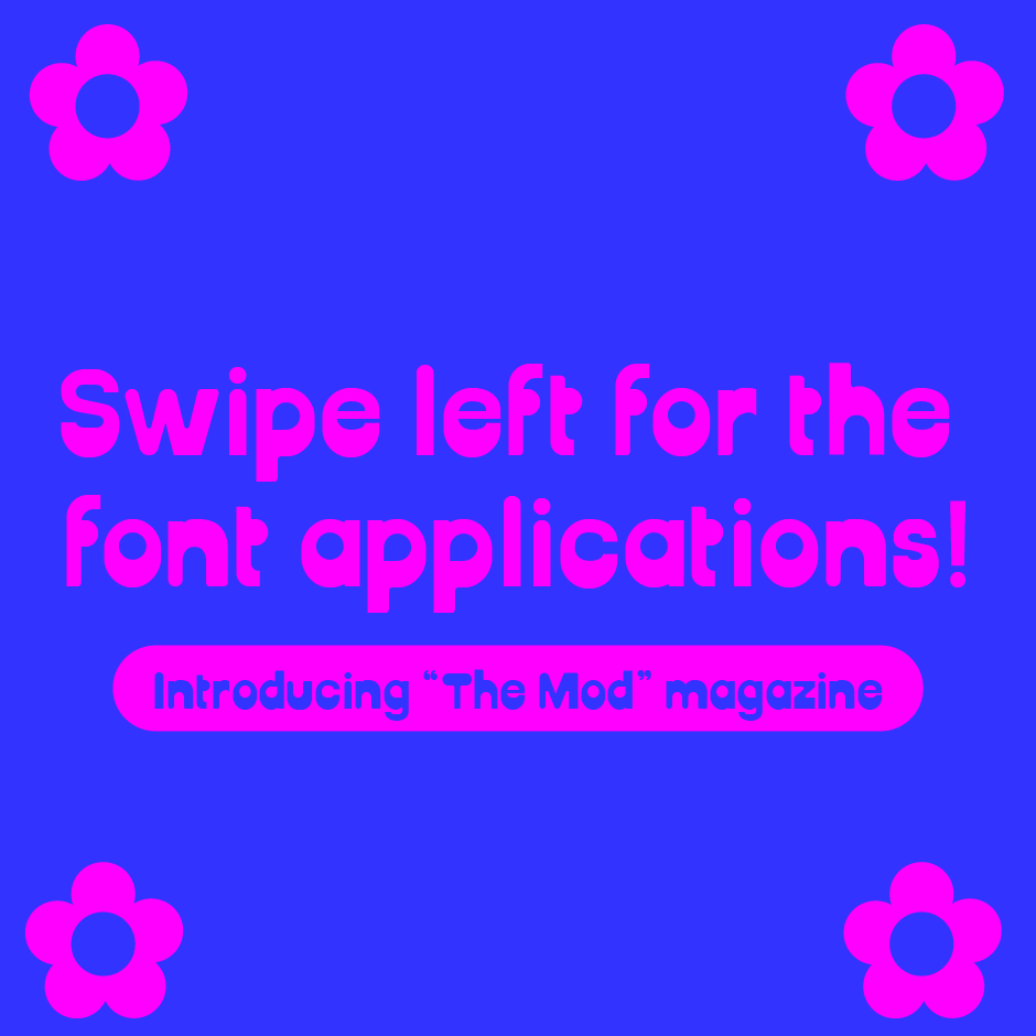 |
Figure 5.5: Font promoting 5 (Week 14, 7/7/23) |
 |
Figure 5.6: Font promoting 6 (Week 14, 7/7/23) |
 |
| Figure 5.7: Magazine title design (Week 14, 7/7/23) |
 |
| Figure 5.8: Magazine cover design 1 (Week 14, 7/7/23) |
 |
| Figure 5.9: Magazine cover design 2 (Week 14, 7/7/23) |
 |
| Figure 6.1: Magazine cover designs (Week 14, 7/7/23) |
 | |
|
 |
| Figure 6.3: Magazine content (Week 14, 7/7/23) |
 |
| Figure 6.4: Magazine content (Week 14, 7/7/23) |
 |
| Figure 6.5: Tote bag 1 (Week 14, 7/7/23) |
 |
| Figure 6.6: Tote bag 2 (Week 14, 7/7/23) |
 |
| Figure 6.7: Tote bag 3 (Week 14, 7/7/23) |
 | |
|
 | |
|
 |
| Figure 7.1: Business card (Week 14, 7/7/23) |
 |
| Figure 7.2: Billboard (Week 14, 7/7/23) |
 |
| Figure 7.3: Billboard (Week 14, 7/7/23) |
 |
| Figure 7.4: Promoting font on Instagram (Week 14, 7/7/23) |
 |
| Figure 7.5: The Mod Instagram Page (Week 14, 7/7/23) |
Figure 7.6: Typeface Presentation & Applications (Week 14, 7/7/23)
FEEDBACK
Week 10
- radius is too strong (exp: the "E" & "F")
- no stability in structure
- build the basic structure of the letters first in all same radius, then after adjust the certain radius that needs to be change
- design wise is fine
Week 11
General
- study the design of letter "X", they are not just diagonal line
Specific
- crafting issue, exp: C, G, they don't balance well
- create a grid structure with circles
General
- consider about how the applications will look like for ur typeface Specific
- the letter X, V can have one thicker stroke
- letter S can be more rounded on the upper part
Reference: Carter, R., Day, B., Meggs, P. B., Maxa, S., & Sanders, M. (2015). Typographic design: Form and communication. Hoboken, New Jersey: John Wiley & Sons, Inc.
REFLECTION
Experience: This is probably the most challenging task I have ever dealt with, constructing letters really takes lots of time and patience. But I like how the task allows us to have freedom in deciding what design direction are we going for. For me, I chose a direction that is related to my specialisation in graphic design, making a font that can be applied to magazine titles, headlines, or other editorial-related media. This direction is something that I am interested in, which makes the experience less stressful. I am quite happy to be able to finish the task despite how challenging it is.
Observation: For my lowercase letters, I realised that starting with the letter "o" really gives me some convenience in constructing other letters. Also the slight difference of the strokes in letter "x" fascinated me, because it is very unnoticeable unless you really zoom in and observe it. When constructing the letterforms, I was also referring to the other sans serif typeface like Futura, Univers, and Helvetica, I have observed minor details that I never noticed before, which helped me a lot in constructing the letterforms.
Findings: This task certainly has some technical aspects that I hadn't considered before. For example, I learned about the importance of consistent x-height across all letters to maintain visual harmony. I also discovered the significance of proper kerning and letter spacing to ensure optimal legibility and readability. These findings have made me more aware of the intricate details that go into creating a well-designed font. Another interesting finding was the impact of font weight and variation on the overall aesthetics of the typeface. I experimented with different weights and explored how they can evoke different moods and convey varying levels of emphasis.
FURTHER READING
 |
| Figure 5.6: Typographic Design: Form & Communication (2015) |
Typographic syntax - line:
- Verbal sentences and typographic lines are formed by joining words together- A line of type consists of a single point size and weight extended horizontally
- Lines can be arranged symmetrically or asymmetrically
- Small changes in point size, weight, or line length affect emphasis
- Typeface selection, alignments, and spacing show visible and distinct connections
- Lines of type: equal, unequal, or centered length.
- Typographic alignments: Bring liveliness and harmony to form, activating the space
- Adjustments and refinements: Enhance unity and coherence of typographic elements

Comments
Post a Comment