29 August 2023 - 6 October 2023 / Week 1 - Week 6
Sim Jia Min 0349784
Publishing Design / Bachelor of Design (Hons) in Creative Media / Taylor's University
Task 2: Content Generation
LECTURES
Lectures are done in
Task 1.
INSTRUCTIONS (MIB)
Task 2: Content Generation
The content of the book, around 4000+ words taken from a published book, "Convenience Store Woman" by Sayaka Murata. The highlighted texts are going to be visualised and featured as visuals in the book.
 |
| Figure 1.1: Visual references (Week 3, 15/9/23) |
This is a visual reference board for the visuals in the book, as my illustration skill is limited, I am trying to play it safe by trying out this kind of minimalistic drawing and conveying the
keywords in the highlighted text.
 |
| Figure 1.2: Colour palette (Week 3, 15/9/23) |
As the illustration direction is going to be simple, it is important to have a contrasting colour palette to make the illustration have a certain depth.
 |
| Figure 1.3: work in progress (Week 3, 15/9/23) |
These are the visuals for my chapters 1 and 2, Mr Vinod has mentioned that the double pages illustration (the bottom row) does not have many things going on, he suggested maintaining the same format but adding some elements to it.
 |
| Figure 1.3: work in progress (Week 4, 22/9/23) |
|
Based on the feedback given, I made some changes to the double pages.
 |
| Figure 1.3: Finalised visuals (Week 5, 29/9/23) |
|
SUBMISSION
Figure 1.4: Content Generation for book (Week 5, 29/9/23)
 |
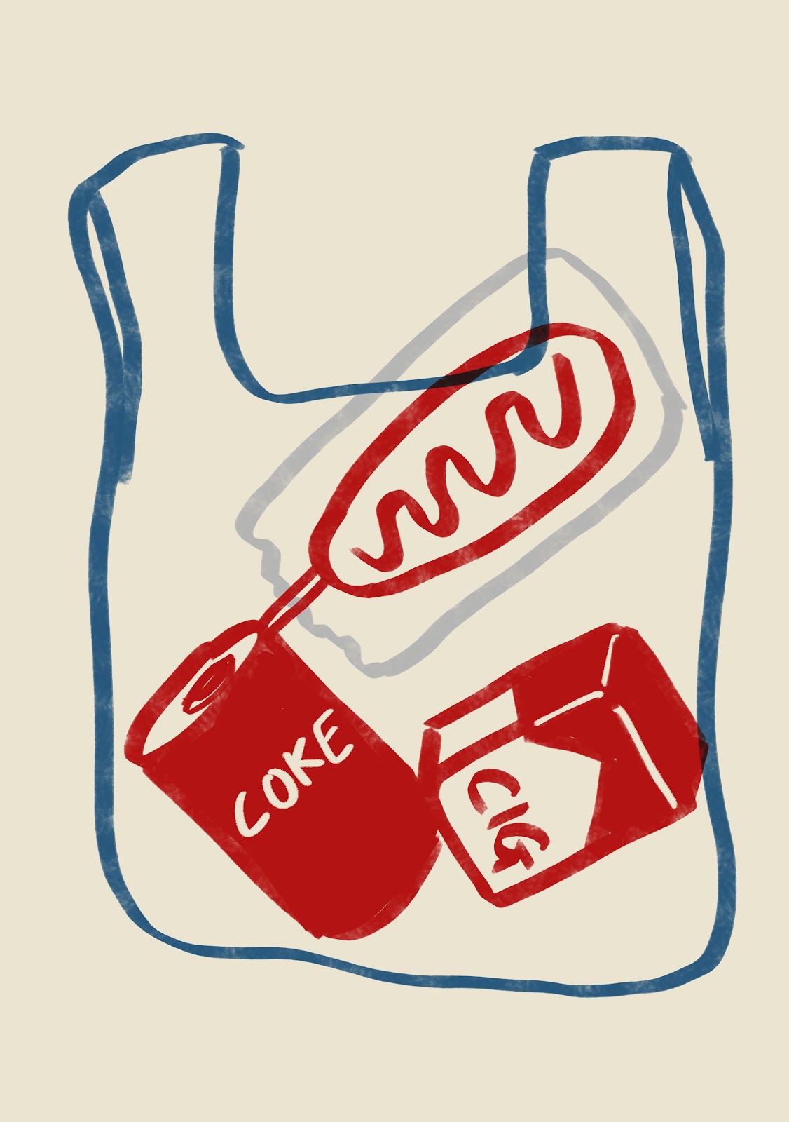
| Figure 1.5: Visual 1 (Week 5, 29/9/23) |
 |
| Figure 1.6: Visual 2 (Week 5, 29/9/23) |
|
 |
Figure 3.1: Visual 15 (Week 5, 29/9/23)
|
|
 |
Figure 3.2: Visual 16 (Week 5, 29/9/23)
|
|
 |
Figure 3.3: Visual 17 (Week 5, 29/9/23)
|
|
 |
Figure 3.4: Visual 18 (Week 5, 29/9/23)
|
|
Figure 3.5: Visuals PDF (Week 5, 29/9/23)
Figure 3.6: Visuals thumbnail JPG (Week 5, 29/9/23)
Figure 3.7: Visuals thumbnail JPG (Week 5, 29/9/23)
FEEDBACK
Week 3
- make them heavier (more things going on)
- explore different angles instead of centralised everything
Week 4
- don't think about text layout when developing visual
- rework the double pages, can maintain the original elements and add other elements
As a person who is not that into drawing illustrations, this task is quite good practice for me. As there's a limitation of drawing skills, I tried my best to keep it simple and consistent while being able to convey the message of the content. I tried to catch the keywords from the texts and visualise them. I did find some difficulties when imagining the visualisation of some content, but I ended up deciding to use some abstract way to visualise it while being able to keep the meaning. Overall I quite enjoyed doing this task, especially satisfied with the colour palette that I chose, as it fits my type of illustration quite well.
Observation:
As the story itself is from a published book, and I have read through the whole novel before, I feel that having a certain familiarity with the story definitely helps with the progress of the illustrations, even though there were some small struggles, overall the progress was quite smooth. One thing I should improve is the composition, as I feel that my illustrations in general look kinda flat, would be more interesting if I explored more variety of composition.
I found that having a fixed colour palette for all the illustrations is important to keep the theme and style consistent, especially for minimalistic drawings like mine, having a variety of colour palettes will probably ruin the outcome. Sources of visual references are also important because sometimes I did really find some gold that would lighten up my idea.
For the reading, I looked up some tips for creating illustrations for published books:


Comments
Post a Comment