Brand Corporate Identity - Task 4
30 October 2023 - 20 November 2023 / Week 10 - Week 13
Sim Jia Min 0349784
Brand Corporate Identity / Bachelor of Design (Hons) in Creative Media / Taylor's University
Task 4: Brand Guideline
INSTRUCTIONS (MIB)
Task 4: Brand Guideline
The purpose of this task is to make a brand guideline book based on the logo, brand positioning and brand applications that I did in previous tasks.
Pinterest board for "The Memoir" branding inspirations: https://pin.it/3Vc4Hvs
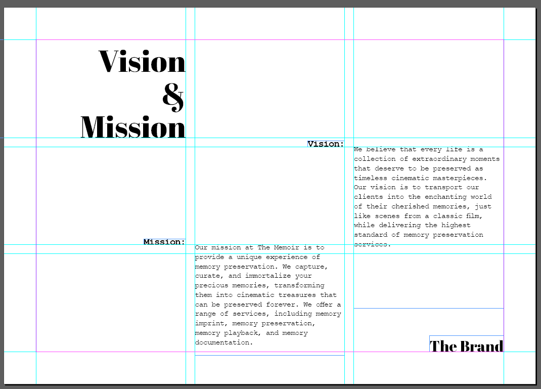
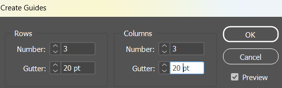
Grids and guides
I tried out some 3 columns+3 rows grids to see whether it can work well with headlines, sub-headlines and body texts.
 |
| Figure 1.1: 3 columns+3 rows |
 | |
|
 |
| Figure 1.3: 3 columns+3 rows |
 |
| Figure 1.3: Guides size |
Colour palette
This is my brand mood board from BCI module, so I decided to used some colours based on this mood board as my brand guidebook background colour palette. |
| Figure 1.4: Brand mood board |
 |
| Figure 1.5: Colour palette for brand guidebook |
Margins
For margins exploration, at first I was going for an all-balance 50pt, but then I realised I needed some space for my navigation bar (top), so I ended up adjusting the margins higher.
 |
| Figure 1.6: Margins before |
 |
| Figure 1.7: Margins before (I messed up the artboard size for this, this is not how the size is supposed to be) |
 |
Figure 1.8: Final margins  |
 |
| Figure 2.1: Navbar, text and images with final margins |
 |
| Figure 2.2: Making interactive PDF |
I used buttons and bookmarks feature in InDesign to make an interactive PDF, and connect the navbar to different sections.
 |
| Figure 2.3: Week 11 progress (thumbnails) |
 |
| Figure 2.4: Week 11 progress (thumbnails) |
 |
| Figure 2.5: Week 11 Progress (thumbnails) |
Figure 2.6: Week 11 Progress
Figure 2.7: Week 13 Progress (thumbnails)
SUBMISSION
Figure 2.8: Final Submission - Brand Guidelines (Interactive PDF)
*This is an interactive PDF file, it is best viewed after downloading and open it on Chrome or Microsoft Edge
FEEDBACK
Week 11
- 3 column grid is fine
- Have some page breaks for full imagery (nostalgic pics, bring readers back to the nostalgic feelings within chapters)
- The headline font can explore more, the serif font doesn't really match with the typewriter, perhaps can use the same font that used in the logo
Week 13
- use an off white/cream colour for logo system section to make it stand out from other sections
- can use a consistent background colour instead of rotating 4
REFLECTION
Doing this brand guideline assignment taught me the importance of a visually cohesive brand identity. I learned to choose colours, fonts, and imagery that align with a brand's personality. Also, understanding the target audience's preferences is also crucial for designing visuals that resonate with them. Through research and analysis, I learned the importance of maintaining a cohesive brand identity, every element played a crucial role in conveying the brand's personality from logo usage to colour schemes. I realized that clarity is key, ensuring that anyone interacting with the brand can easily understand and apply the guidelines.

Comments
Post a Comment