22 September 2023 - 27 October / Week 4 - Week 9
Sim Jia Min 0349784
Publishing Design / Bachelor of Design (Hons) in Creative Media / Taylor's University
Task 3A: Book
LECTURES
Lectures are done in
Task 1.
INSTRUCTIONS (MIB)
Task 3A: Book
 |
Figure 1.1: Chosen book size from task 1: B5, 17.6cm x 25cm (Week 2, 8/9/23)
|
Figure 1.2: Book content, Convenience Store Woman by Sayaka Murata (Week 2, 8/9/23)
Figure 1.3: Visuals PDF (Week 5, 29/9/23)
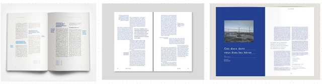 |
| Figure 1.4: Layout references |
Figure 1.5: Grid (Week 5, 29/9/23)
Chosen grid of the layout, using the chosen typesetting from type specimen exercise.
Typesetting
Heading: Helvetica Neue bold (size 30pt)
Pullquote: Garamond bold (size 11pt, leading 13pt)
Subtext: Garamond italic (size 8pt, leading 10pt)
Body text: Garamond regular (size 9pt, leading 12pt, paragraph spacing 12pt, line length around 51 characters)
 |
Figure 1.6: Layout margins and columns (Week 5, 29/9/23)
|
 |
| Figure 1.7: Layout progress of chapter 1 (Week 5, 29/9/23) |
 |
Figure 1.8: Layout progress of chapter 1 (Week 5, 29/9/23)
|
 |
| Figure 1.9: Printed draft (Week 5, 29/9/23) |
According to Mr Vinod's feedback, the position of chapter title needs to be consistently placed the same, either all right or all left.
 |
| Figure 2.4: Printed thumbnail (Week 6, 6/10/23) |
 |
| Figure 2.5: Printed thumbnail (Week 6, 6/10/23) |
|
 |
| Figure 2.6: Printed thumbnail (Week 6, 6/10/23) |
|
 |
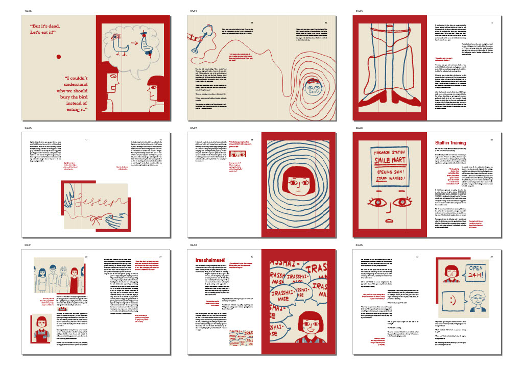
Figure 2.7: Printed book in B&W (Week 7, 13/10/23)
|
 |
Figure 2.8: Printed book in B&W (Week 7, 13/10/23)
|
SUBMISSIONFigure 3.4: Final book thumbnail PDF(Week 8, 20/10/23)
Figure 3.5: Final book thumbnail with baseline and grids PDF (Week 8, 20/10/23)
Figure 3.6: Final book spreads PDF (Week 8, 20/10/23)
 |
| Figure 3.7: Final book cover design JPG |
 |
Figure 3.8: Half title JPG
|
 |
Figure 3.9: Full title JPG
|
 |
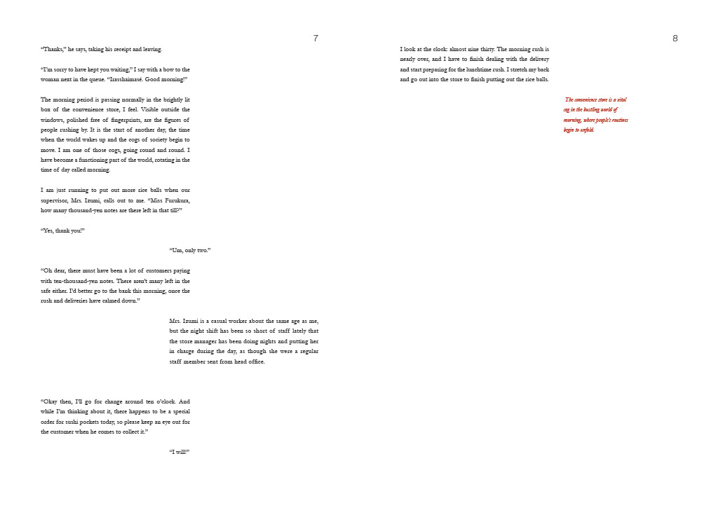
Figure 4.1: Imprints and content JPG
|
 |
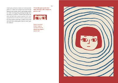
Figure 4.2: Chapter 1 spread 1 JPG
|
Paper Material
Book cover (front and back): Matte art card 210gsm
Content pages: Maple white paper 170gsm
Binding: Stapler
Cost: RM90+
 |
Figure 6.1: Front cover (Week 9, 27/10/23)
|
 |
Figure 6.2: Back cover (Week 9, 27/10/23)
|
 |
Figure 6.3: Covers (Week 9, 27/10/23)
|
|
 |
Figure 6.4: Content pages (Week 9, 27/10/23)
|
 |
Figure 6.5: Content pages (Week 9, 27/10/23)
|
 |
Figure 6.6: Content pages (Week 9, 27/10/23)
|
 |
Figure 6.7: Content pages (Week 9, 27/10/23)
|
 |
Figure 6.8: Content pages (Week 9, 27/10/23)
|
https://online.fliphtml5.com/tmzob/knog/
FEEDBACK
Week 5
- redo the half title and title
- make sure the size of the page title remain the same
- the column size of the subtext should be the same
Week 6
- cover (something that stands out)
- add notes: could write something about the visuals, or any other thoughts
- task 2 visual: thumbnail and individual
- page number: helvetica light
- page 23: fill up the space
- print B&W and binding (need to choose what kind of paper texture)
Week 7
- Publisher missing on cover
- the name of author on full title can be on the same line
- paper on the type of paper that use for printing
- prologue: the... can be on the same line
- garamond regular 9pt looks delicate
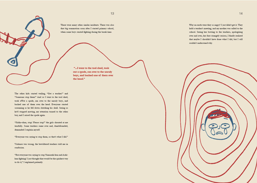
- page 13 and 14 without the red column
- back cover barcode should have 5mm of space
REFLECTION
Experience: Doing this task was a great learning experience, especially when its something that I quite enjoy about, which is making layout arrangements. The reason why I used a two-column grid layout is that there are a lot of dialogues happening in the story, and the line in the middle can make the dialogue lines face each other, like how I imagine the characters are talking face to face. The two-column grid layout is really interesting and fun to play with, there are many possibilities to explore. I am also glad that I found some good references to refer to throughout the design process.
Observations: Figuring out the layout was like trying to organize a chaotic group project. Each page had to tell its story while contributing to the grand narrative. I also found a good integration between text and image plays an important role in enhancing the aesthetic and conveying narrative effectively. One thing I feel like I can improve is the cover design, I am not entirely satisfied with it because I feel like it should be a more subtle and symbolistic kind of illustration, like how I did for my inner page illustrations. The cover design for now is too straightforward (just a woman with convenience store worksuit), at some point it just boring and doesn't really have a visual hook.
Findings: I found the importance of white space, it is important to serve a visually pleasing and clean look of layout. I also learned that the price of printing is absolutely not a joke, but the printing result is quite worth the price, the texture of maple white paper feels nice to touch.


Comments
Post a Comment